Intro to Data Visualization with Matplotlib
Why is data visualization important?
“A picture is worth a thousand words”
Because of the way the human brain processes information, using charts or graphs to visualize large amounts of complex data is easier than poring over spreadsheets or reports. Data visualization is a quick, easy way to convey concepts in a universal manner – and you can experiment with different scenarios by making slight adjustments.
What is Matplotlib?
The matplotlib Python library, developed by John Hunter and many other contributors, is used to create high-quality graphs, charts, and figures. The library is extensive and capable of changing very minute details of a figure.
Some basic concepts and functions provided in matplotlib are
Figure and axes
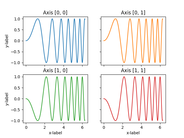
The entire illustration is called a figure and each plot on it is an axes (do not confuse Axes with Axis). The figure can be thought of as a canvas on which several plots can be drawn. We obtain the figure and the axes using the subplots() function
Plotting
The very first thing required to plot a graph is data. A dictionary of key-value pairs can be declared, with keys and values as the x and y values. After that, scatter(), bar(), and pie(), along with tons of other functions, can be used to create the plot.
Axis
The figure and axes obtained using subplots() can be used for modification. Properties of the x-axis and y-axis (labels, minimum and maximum values, etc.) can be changed using Axes.set()
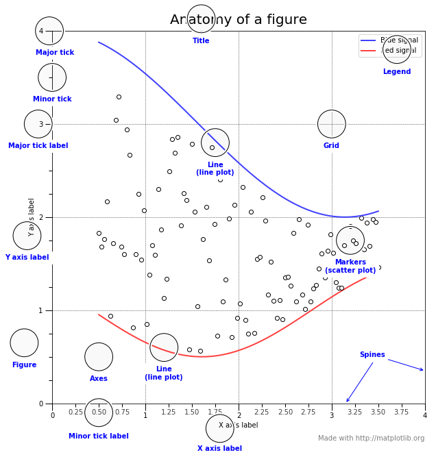
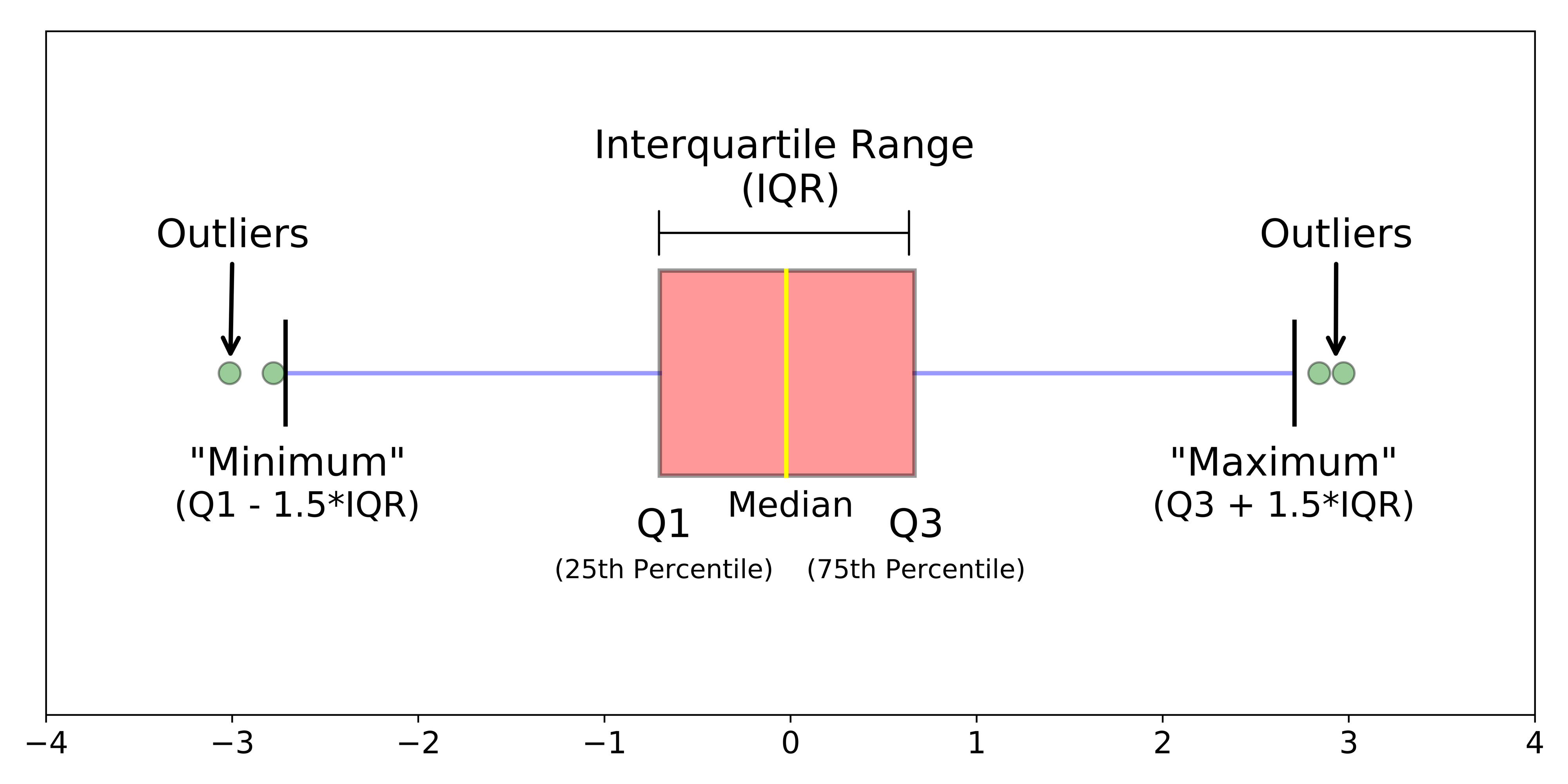
Anatomy of a Figure
A matplotlib visualization is a figure onto which is attached one or more axes. Each axes has a horizontal (x) axis and vertical (y) axis, and the data is encoded using color and glyphs such as markers (for example circles) or lines or polygons (called patches). The figure below annotates these parts of a visualization and was created by Nicolas P. Rougier using matplotlib. The source code can be found in the matplotlib documentation.
Basic Charts / Graphs
Line Plot
Histograms
Scatter Plot
Box plots
Bar Plots
Pie Chart
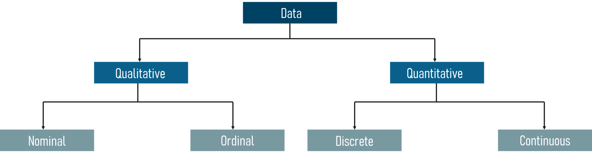
Take a look at data types
Import Library
import matplotlib.pyplot as plt # plt is the convention, also known as nickname
Line Plot
Line Graph: a graph that shows information that is connected in some way (such as change over time)

# <---Fake Data for Plotting---->
# Median ages
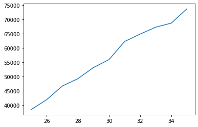
ages = [25, 26, 27, 28, 29, 30, 31, 32, 33, 34, 35]
# Median Microbiologist Salaries by Age
mib_salary = [38496, 42000, 46752, 49320, 53200, 56000, 62316, 64928, 67317, 68748, 73752]
# Median Pharmacist Salaries by Age
pharma_salary = [45372, 48876, 53850, 57287, 63016,65998, 70003, 70000, 71496, 75370, 83640]
# Median Cader Salaries by Age
bcs_salary = [37810, 43515, 46823, 49293, 53437,56373, 62375, 66674, 68745, 68746, 74583]
Create Simple Line Plot
plt.plot(ages, mib_salary)
plt.show()
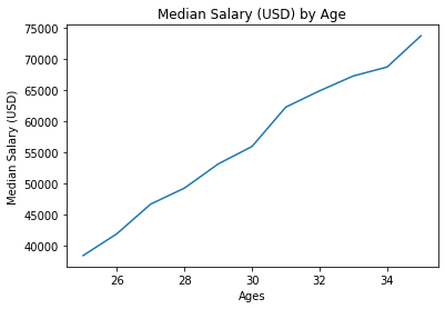
Add Title, Labels
plt.plot(ages, mib_salary)
plt.xlabel('Ages')
plt.ylabel('Median Salary (USD)')
plt.title('Median Salary (USD) by Age')
plt.show()
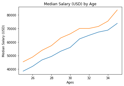
Comparison
# Microbiology
plt.plot(ages, mib_salary)
# Pharmacy
plt.plot(ages, pharma_salary)
plt.xlabel('Ages')
plt.ylabel('Median Salary (USD)')
plt.title('Median Salary (USD) by Age')
plt.show()
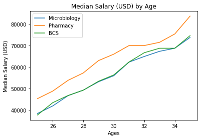
Add Legend
# Microbiology
plt.plot(ages, mib_salary, label="Microbiology")
# Pharmacy
plt.plot(ages, pharma_salary, label= "Pharmacy")
# BCS
plt.plot(ages, bcs_salary, label= "BCS")

plt.xlabel('Ages')
plt.ylabel('Median Salary (USD)')
plt.title('Median Salary (USD) by Age')
plt.legend()
plt.show()

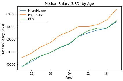
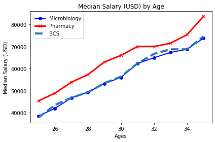
Legend Position
# Microbiology
plt.plot(ages, mib_salary, label="Microbiology")
# Pharmacy
plt.plot(ages, pharma_salary, label= "Pharmacy")
# BCS
plt.plot(ages, bcs_salary, label= "BCS")

plt.xlabel('Ages')
plt.ylabel('Median Salary (USD)')
plt.title('Median Salary (USD) by Age')
plt.legend(loc="best")
plt.show()
Nicely fit in the figure
# Microbiology
plt.plot(ages, mib_salary, label="Microbiology")
# Pharmacy
plt.plot(ages, pharma_salary, label= "Pharmacy")
# BCS
plt.plot(ages, bcs_salary, label= "BCS")

plt.xlabel('Ages')
plt.ylabel('Median Salary (USD)')
plt.title('Median Salary (USD) by Age')
plt.legend()
plt.tight_layout()
plt.show()
Customization
SEE MORE: https://matplotlib.org/3.2.1/api/_as_gen/matplotlib.pyplot.plot.html
Color
Marker
Marker Size
Line Style
Line width
# Microbiology
plt.plot(ages, mib_salary, label="Microbiology",  color="b", linewidth=2, marker='o')
# Pharmacy
plt.plot(ages, pharma_salary, label= "Pharmacy", color="red", linewidth=3, marker='x')
# BCS
plt.plot(ages, bcs_salary, label= "BCS", linewidth=4, linestyle='--')

plt.xlabel('Ages')
plt.ylabel('Median Salary (USD)')
plt.title('Median Salary (USD) by Age')
plt.legend()
plt.tight_layout()
plt.show()
Hex Color
# Microbiology
plt.plot(ages, mib_salary, label="Microbiology", color='#444444')
# Pharmacy
plt.plot(ages, pharma_salary, label= "Pharmacy")
# BCS
plt.plot(ages, bcs_salary, label= "BCS", linestyle='--')

plt.xlabel('Ages')
plt.ylabel('Median Salary (USD)')
plt.title('Median Salary (USD) by Age')
plt.legend()
plt.tight_layout()
plt.show()
Font Size
# Microbiology
plt.plot(ages, mib_salary, label="Microbiology",  color="b", linewidth=2, marker='o')
# Pharmacy
plt.plot(ages, pharma_salary, label= "Pharmacy", color="red", linewidth=3, marker='x')
# BCS
plt.plot(ages, bcs_salary, label= "BCS", linewidth=4, linestyle='--')

plt.xlabel('Ages', fontsize=12)
plt.ylabel('Median Salary (USD)', fontsize=12)
plt.title('Median Salary (USD) by Age', fontsize=12)
plt.legend()
plt.tight_layout()
plt.show()
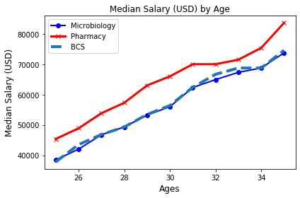
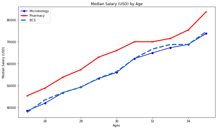
Figure Size
plt.figure(figsize=(10,6))
# Microbiology
plt.plot(ages, mib_salary, label="Microbiology",  color="b", linewidth=2, marker='o')
# Pharmacy
plt.plot(ages, pharma_salary, label= "Pharmacy", color="red", linewidth=3, marker='x')
# BCS
plt.plot(ages, bcs_salary, label= "BCS", linewidth=4, linestyle='--')

plt.xlabel('Ages')
plt.ylabel('Median Salary (USD)')
plt.title('Median Salary (USD) by Age')
plt.legend()
plt.tight_layout()
plt.show()

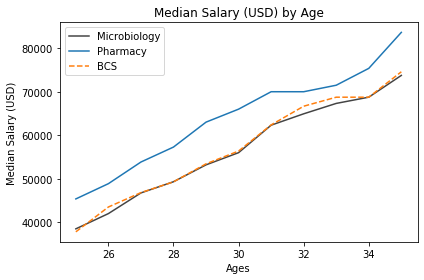
Add Style or Themes
# Available styles
plt.style.available
plt.figure(figsize=(10,6))
# plt.style.use("fivethirtyeight")
# Microbiology
plt.plot(age, mib_salary, label="Microbiology",  color="b", linewidth=2, marker='o')
# Pharmacy
plt.plot(ages, pharma_salary, label= "Pharmacy", color="red", linewidth=3, marker='x')
# BCS
plt.plot(ages, bcs_salary, label= "BCS", linewidth=4, linestyle='--')

plt.xlabel('Ages')
plt.ylabel('Median Salary (USD)')
plt.title('Median Salary (USD) by Age')
plt.legend()
plt.tight_layout()
plt.show()
Exporting Figure & Put it Together
plt.figure(figsize=(10,6))
# plt.style.use("fivethirtyeight")
# Microbiology
plt.plot(ages, mib_salary, label="Microbiology",  color="b", linewidth=2, marker='o')
# Pharmacy
plt.plot(ages, pharma_salary, label= "Pharmacy", color="red", linewidth=3, marker='x')
# BCS
plt.plot(ages, bcs_salary, label= "BCS", linewidth=4, linestyle='--')

plt.xlabel('Ages')
plt.ylabel('Median Salary (USD)')
plt.title('Median Salary (USD) by Age')
plt.legend()
plt.tight_layout()
plt.savefig("median_salary.pdf") # .pdf, .png, .jpg, .jepg, .tiff
plt.show()
Subplots
In fiction, a subplot is a secondary strand of the plot that is a supporting side story for any story or the main plot. Subplots may connect to main plots, in either time and place or in thematic significance. Subplots often involve supporting characters, those besides the protagonist or antagonist.
fig, ax = plt.subplots(nrows=2, ncols=3)
print(ax)
[[<matplotlib.axes._subplots.AxesSubplot object at 0x7ff633127a90>
  <matplotlib.axes._subplots.AxesSubplot object at 0x7ff633193090>
  <matplotlib.axes._subplots.AxesSubplot object at 0x7ff6331c75d0>]
 [<matplotlib.axes._subplots.AxesSubplot object at 0x7ff6332e8e10>
  <matplotlib.axes._subplots.AxesSubplot object at 0x7ff63337f5d0>
  <matplotlib.axes._subplots.AxesSubplot object at 0x7ff6335340d0>]]
fig, ax = plt.subplots(2, 3, sharex='col', sharey='row')
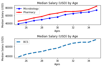
fig, (ax1, ax2) = plt.subplots(nrows=2, ncols=1)
# plt.style.use("fivethirtyeight")
# Microbiology
ax1.plot(ages, mib_salary, label="Microbiology",  color="b", linewidth=2, marker='o')
# Pharmacy
ax1.plot(ages, pharma_salary, label= "Pharmacy", color="red", linewidth=3, marker='x')
# BCS
ax2.plot(ages, bcs_salary, label= "BCS", linewidth=4, linestyle='--')

ax1.set_xlabel('Ages')
ax1.set_ylabel('Median Salary (USD)')
ax1.set_title('Median Salary (USD) by Age')
ax1.legend()

ax2.set_xlabel('Ages')
ax2.set_ylabel('Median Salary (USD)')
ax2.set_title('Median Salary (USD) by Age')
ax2.legend()

plt.tight_layout()
plt.savefig("median_salary.pdf") # .pdf, .png, .jpg, .jepg, .tiff
plt.show()
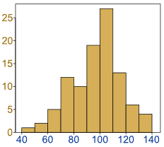
Histograms
Histogram: a graphical display of data using bars of different heights.
The height of each bar shows how many fall into each range.
And you decide what ranges to use!
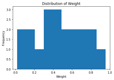
Create Histogram
import random
weight = [random.random() for i in range(20)]
plt.hist(weight)
plt.xlabel("Weight")
plt.ylabel("Frequency")
plt.title("Distribution of Weight")
plt.show()
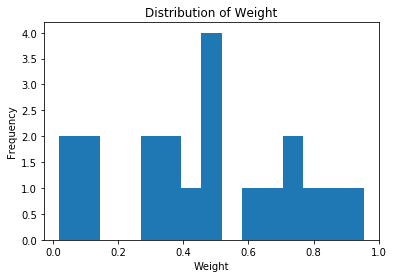
plt.hist(weight, bins=15)
plt.xlabel("Weight")
plt.ylabel("Frequency")
plt.title("Distribution of Weight")
plt.show()
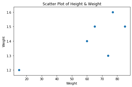
Scatter Plot
A scatter plot (also called a scatterplot, scatter graph, scatter chart, scattergram, or scatter diagram) is a type of plot or mathematical diagram using Cartesian coordinates to display values for typically two variables for a set of data.

# Height in(m)
height = [1.4, 1.2, 1.5, 1.3, 1.6, 1.5]
# Weight in (Kg)
weight = [60, 15, 85, 74, 77, 65]
plt.scatter(weight, height)
plt.xlabel("Weight")
plt.ylabel("Weight")
plt.title("Scatter Plot of Height & Weight")
plt.tight_layout()
plt.show()
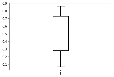
Box Plot
A boxplot is a standardized way of displaying the distribution of data based on a five number summary (“minimum”, first quartile (Q1), median, third quartile (Q3), and “maximum”). It can tell you about your outliers and what their values are
import random
collection = [random.random() for i in range(10)]
plt.boxplot(collection)
plt.show()
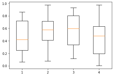
Side by Side Box Plot
import random
collectn_1 = [random.random() for i in range(10)]
collectn_2 = [random.random() for i in range(15)]
collectn_3 = [random.random() for i in range(20)]
collectn_4 = [random.random() for i in range(15)]
collections = [collectn_1, collectn_2, collectn_3, collectn_4]
plt.boxplot(collections)
plt.show()
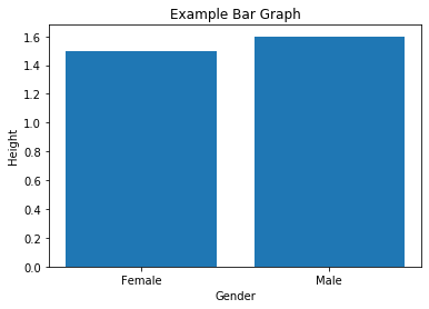
Bar Plot
# <---Fake Data for Plotting---->
# Gender
gender = ["Female", "Male", "Female", "Male", "Male", "Female"]

# Age group
age_group = ["Adult", "Child", "Adult", "Adult","Adult","Elderly"]

# Height in(m)
height = [1.4, 1.2, 1.5, 1.3, 1.6, 1.5]

# Weight in (Kg)
weight = [60, 15, 85, 74, 77, 65]
plt.bar(gender, height)
plt.xlabel("Gender")
plt.ylabel("Height")
plt.title("Example Bar Graph")
plt.show()
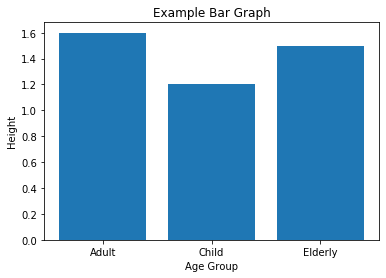
plt.bar(age_group, height)
plt.xlabel("Age Group")
plt.ylabel("Height")
plt.title("Example Bar Graph")
plt.show()
Histograms vs Bar Graphs
Bar Graphs are good when your data is in categories (such as “Comedy”, “Drama”, etc).
But when you have continuous data (such as a person’s height) then use a Histogram.
It is best to leave gaps between the bars of a Bar Graph, so it doesn’t look like a Histogram.

Pie Chart
Pie Chart: a special chart that uses “pie slices” to show relative sizes of data.
It is a really good way to show relative sizes: it is easy to see which movie types are most liked, and which are least liked, at a glance.

Create Simple Pie Chart
# <---Fake Data for Plotting---->
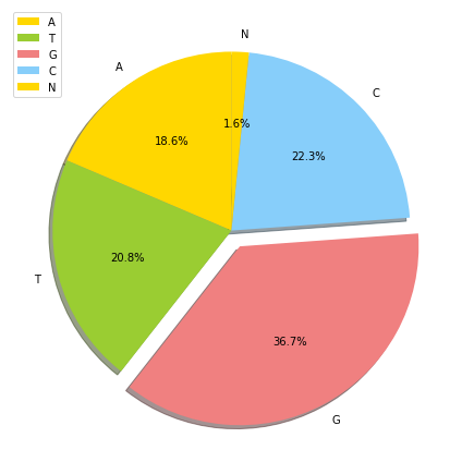
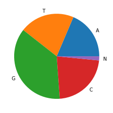
labels = ["A", "T", "G", "C", "N"]
sizes = [1057, 1184, 2089, 1267, 89]
plt.pie(sizes, labels=labels)
plt.show()
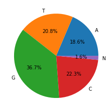
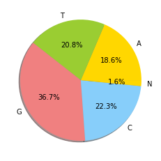
Add Percentage
plt.pie(sizes, labels=labels, autopct='%1.1f%%')
plt.show()
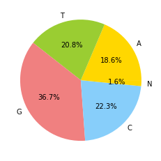
Add Colors
colors = ['gold', 'yellowgreen', 'lightcoral', 'lightskyblue']
plt.pie(sizes, labels=labels, autopct='%1.1f%%', colors=colors)
plt.show()
Shadow
plt.pie(sizes, labels=labels, autopct='%1.1f%%', colors=colors, shadow=True)
plt.show()
Explode
explode = (0, 0, 0.1, 0, 0) # only "explode" the 3rdslice (i.e. 'Hogs')
plt.figure(figsize=(10,6))
plt.pie(sizes, labels=labels, autopct='%1.1f%%', colors=colors, shadow=True, startangle=90, explode=explode)
plt.legend(loc="best")
plt.tight_layout()
plt.show()